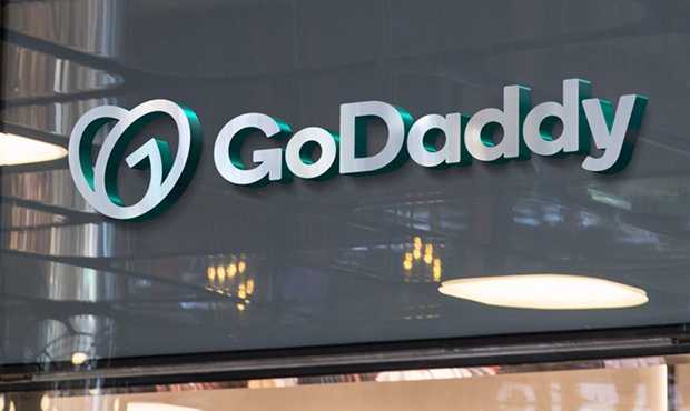
So long, Red: Arizona-based GoDaddy unveils new logo minus dude
Jan 15, 2020, 12:52 PM | Updated: 1:41 pm

(GoDaddy Photo)
(GoDaddy Photo)
After 23 years, a certain gingerhair character who was the sunglasses-wearing face of GoDaddy has been gently shown the door.
The Scottsdale-based web-hosting giant introduced a new logo Tuesday, a looping swirl of a “Go” design which “captures the essence of entrepreneurial spirit, pays homage to the importance of humanity, and exudes a feeling of joy.”
That is … a lot to cram into a couple of circles.
CEO Aman Bhutani told Fast Company to him the logo looked like “a young girl who’s a little bit of a bandit, with a ponytail and a patch over her eye, who wants to grow up and be somebody.”
Uh, we did not see that one coming. Maybe he was kidding.
The internet, however, was not kidding around:
I had to stare at that at the logo mark for a solid minute until I spotted the G. I still can't see the D… If there is one. https://t.co/YiDqdg7Gyh#logodesign #branding #godaddylogo #GraphicDesigner pic.twitter.com/ADB9uqABIT
— Colin Finkle (@ColinFinkle) January 15, 2020
#GoDaddy #GoDaddyLogo pic.twitter.com/G9epqIqThj
— 𝐢𝐁𝐃𝐖𝐑 (@iBDWR) June 22, 2018
So… I guess I'm the only one that hates the new #GoDaddy branding.
— Jon Stefaniak (@mediumjon) January 15, 2020
Daddy's in love. Go ❤️- Go Daddy. The new GoDaddy logo. I like the shape. I would color it, though – see black heart meaning. 🖤#GoDaddy pic.twitter.com/8njHgF4wcd
— Leo Angelo 🇺🇸 (@leoaus) January 15, 2020
Quartz thought the logo looked a little like AirBnB’s heart motif.
Let’s take a look:
There were no reports of an official sendoff for the dude with the wavy orange squiggles atop his head.
Here’s to you, pal. Enjoy retirement.

(GoDaddy Photo)
What do you think GoDaddy’s new logo looks like? Tell us below in the comments.


